Flex布局详解
什么是Flex布局
Flex是Flexible Box的缩写 flex布局表示弹性布局,可以为盒状模型提供最大的灵活性。
Flex布局和传统布局对比
- 传统布局:兼容性好,布局繁琐,局限性在移动端不能很好布局
- Flex布局:简单,操作方便,兼容性差
- Pc采用传统布局,移动端或者不考虑兼容的pc可采用flex布局
Flex布局原理
Flex布局原理就是:给父盒子添加flex属性,来控制子盒子的位置排列方式从而实现flex布局。当我们为父盒子设为flex布局以后,子元素的float、clear和vertical-align属性将失效。Flex布局又叫伸缩布局、弹性布局、伸缩盒布局、弹性盒布局、flex布局。Flex布局适用范围
任何一种元素都可以指定为flex布局
行内元素也可以使用Flex布局.wrap{ display:flex; }
Webkit内核的浏览器,必须加上-webkit前缀。.box{ display: inline-flex; }.box{ display: -webkit-flex; /* Safari */ display: flex; }flex布局中的一些基本概念
容器和项目
什么叫容器
采用flex布局的元素被称作容器。
什么叫项目
在flex布局中的子元素被称作项目。即父级元素采用flex布局,则父级元素为容器,全部子元素自动成为项目
容器默认存在两根轴:水平的主轴(main axis)和垂直的交叉轴(cross axis)。主轴的开始位置(与边框的交叉点)叫做main start,结束位置叫做main end;交叉轴的开始位置叫做cross start,结束位置叫做cross end。
项目默认沿主轴排列。单个项目占据的主轴空间叫做main size,占据的交叉轴空间叫做cross size
flex布局父项常见属性
有六个常用属性设置在容器上,分别为:
- flex-direction
- flex-wrap
- flew-flow
- justify-content
- align-items
- align-content
flex-direction属性
Flex布局中默认的主轴是row,x轴
如果想改变主轴方向可通过设置flex-direction来改变
flex-direction:column;将主轴改为y轴,纵轴
flex-direction:row;将主轴改为x轴,横轴
flex-direction:row-reverse;主轴为x轴,并且翻转
flex-direction:column-reverse;主轴为y轴,并且翻转
 .flexClass{
      display: flex;
      background-color: antiquewhite;
      width: 900px;
      height: 500px;
      margin: 0 auto;
      flex-direction:row;
     }

     .flexClass div:nth-child(1){
       background-color:aqua;
       width: 200px;
       height: 200px;
     }

     .flexClass div:nth-child(2){
       background-color:blue;
       width: 200px;
       height: 200px;
     }


     .flexClass div:nth-child(3){
       background-color:blueviolet;
       width: 200px;
       height: 200px;
     }

     .flexClass div:nth-child(4){
       background-color:cadetblue;
       width: 200px;
       height: 200px;
     }
    <div class="flexClass">
           <div>1</div>
           <div>2</div>
           <div>3</div>
           <div>4</div>
    </div>
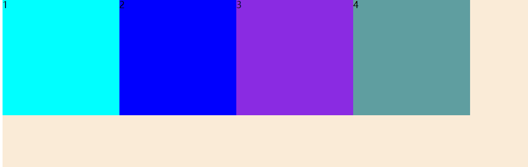
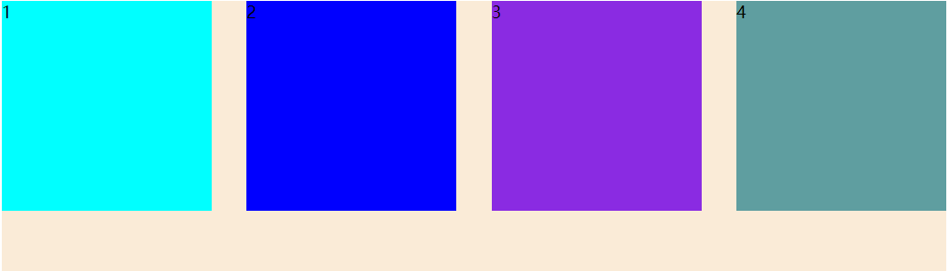
flex-direction:row;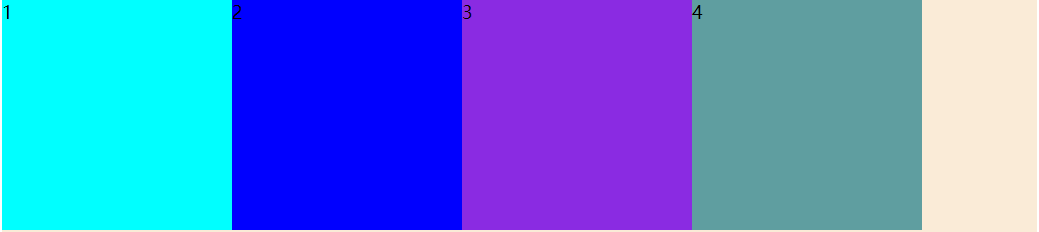
flex-direction:column;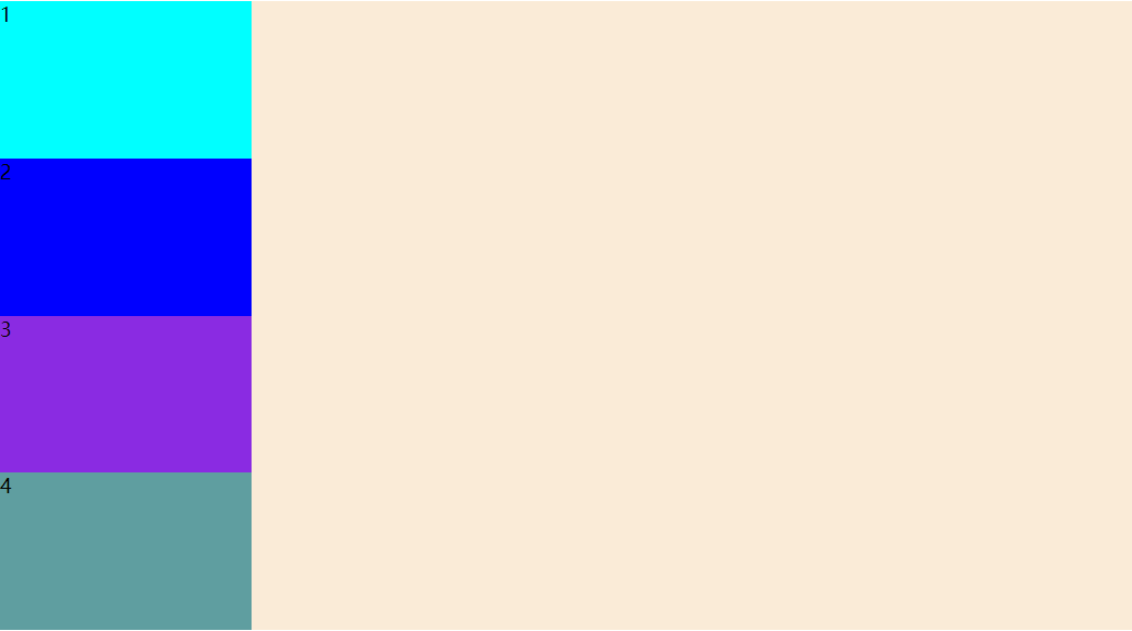
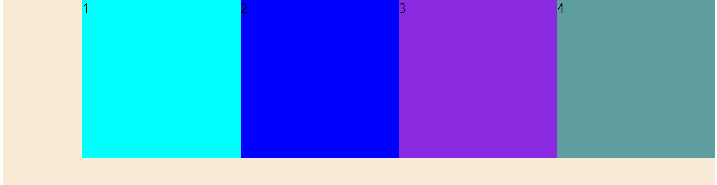
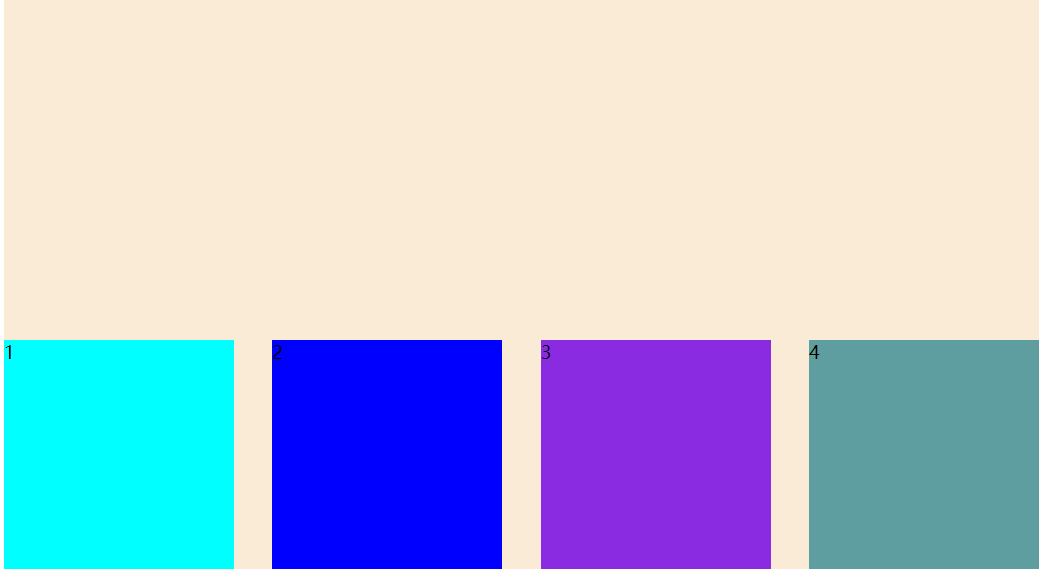
flex-direction:row-reverse;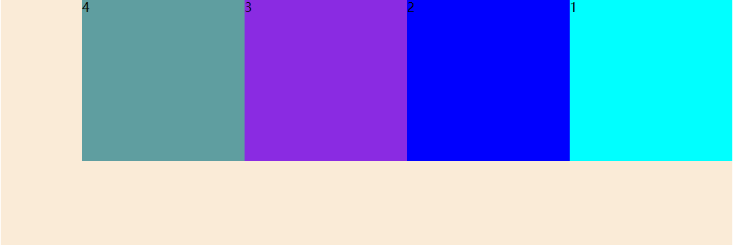
flex-direction:column-reverse;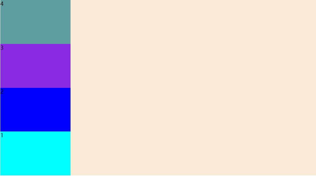
Flex布局父项justify-conten属性
通过justify-content能够设置主轴子元素排列形式
值为flex-start所有子元素在主轴头部显示
值为flex-end所有子元素在主轴尾部显示
值为flex-center所有子元素在主轴居中对齐
值为space-around所有子元素平分剩余空间
值为space-between所有子元素先两边贴边在平分剩余空间
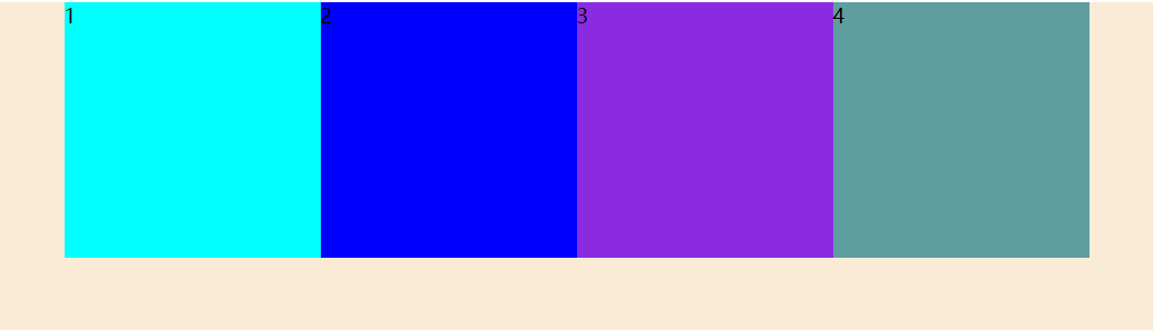
justify-content:flex-start
justify-content:flex-end;
justify-content:center;
justify-content:space-around;
justify-content:space-between;
flex-wrap
开启flex布局后默认为不换行
如果想要换行效果设置flex-wrap:wrap
align-items属性
利用align-items能够设置侧轴元素对齐的方式在子项为单项(单行)的时候使用
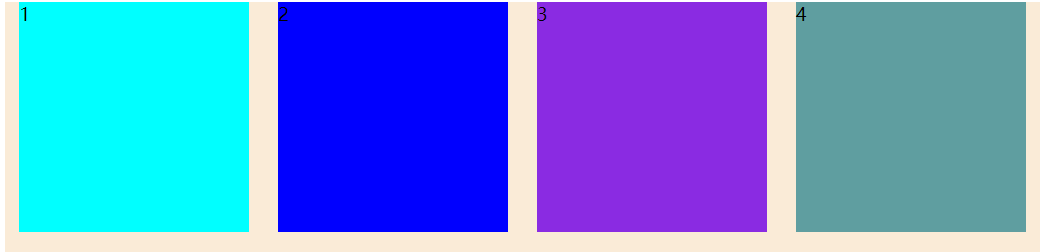
align-items的值为flex-start表示从头开始
align-items的值为flex-end表示从结尾开始
align-items的值为center表示居中显示
align-items的值为stretch会将子元素拉伸
flex-direction:row;
justify-content:space-between;
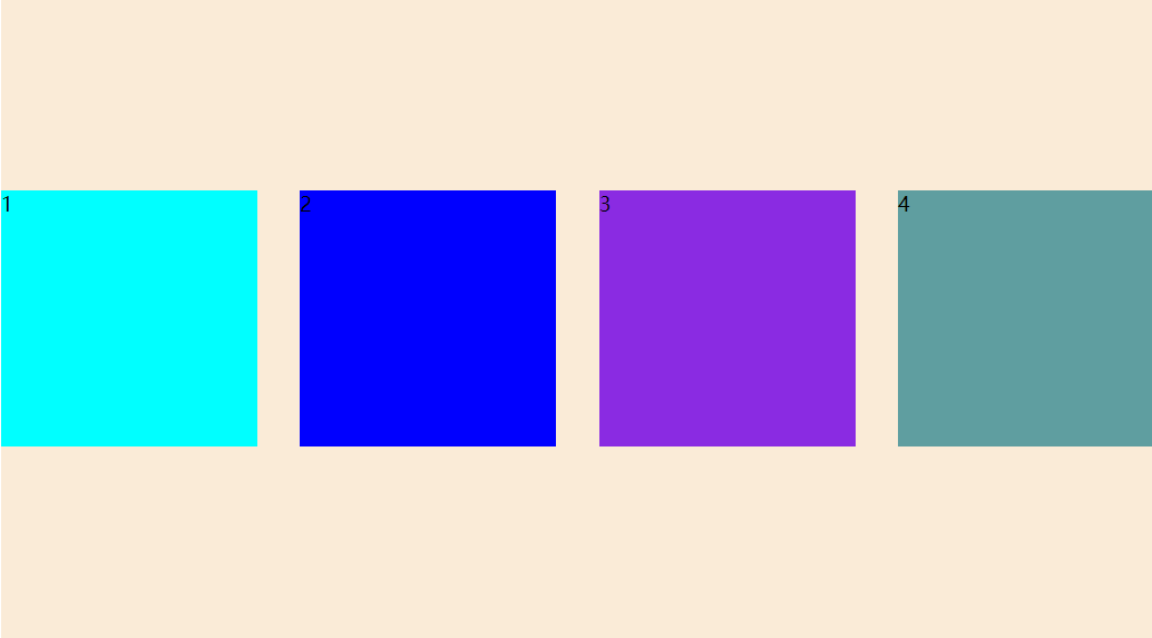
align-items:flex-start;

   flex-direction:row;
   justify-content:space-between;
   align-items:flex-end;
   flex-direction:row;
   justify-content:space-between;
   align-items:center;
   flex-direction:row;
   justify-content:space-between;
   align-items:stretch;
弹性盒子侧轴为水平,如果其项目没有宽度,则会拉伸至弹性盒子一样的宽,如果侧轴为垂直,如果其项目没有高度,则会拉伸至弹性弹性盒子一样高
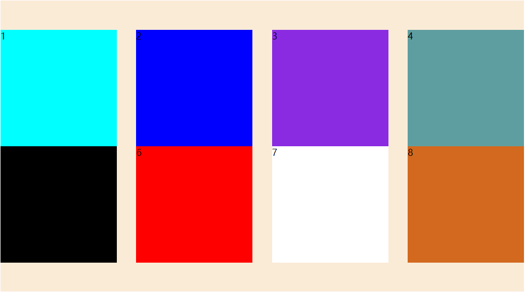
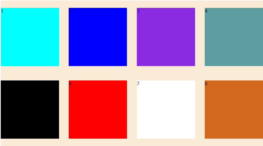
Align-content属性
Align-content属性适应于换行(多行)的情况下(单行情况下无效),可以设置上对齐、下对齐、居中、拉伸以及平均分配剩余空间等属性值
Align-item和align-content的区别单行找align-items多行找align-content
<!DOCTYPE html>
<html lang="en">
<head>
    <meta charset="UTF-8">
    <meta http-equiv="X-UA-Compatible" content="IE=edge">
    <meta name="viewport" content="width=device-width, initial-scale=1.0">
    <title>Document</title>
    <style  >

     .flexClass{
      display: flex;
      background-color: antiquewhite;
      width: 900px;
      height: 500px;
      margin: 0 auto;
      flex-direction:row;
      justify-content:space-between;
      flex-wrap: wrap;
      align-content:flex-start;
     }

     .flexClass div:nth-child(1){
       background-color:aqua;
       width: 200px;
       height: 200px;
     }

     .flexClass div:nth-child(2){
       background-color:blue;
       width: 200px;
       height: 200px;
     }


     .flexClass div:nth-child(3){
       background-color:blueviolet;
       width: 200px;
       height: 200px;
     }

     .flexClass div:nth-child(4){
       background-color:cadetblue;
       width: 200px;
       height: 200px;
     }

     .flexClass div:nth-child(5){
       background-color:black;
       width: 200px;
       height: 200px;
     }

     .flexClass div:nth-child(6){
       background-color:red;
       width: 200px;
       height: 200px;
     }


     .flexClass div:nth-child(7){
       background-color:white;
       width: 200px;
       height: 200px;
     }

     .flexClass div:nth-child(8){
       background-color:chocolate;
       width: 200px;
       height: 200px;
     }


    </style>

</head>
<body>
    <div class="flexClass">
           <div>1</div>
           <div>2</div>
           <div>3</div>
           <div>4</div>
           <div>5</div>
           <div>6</div>
           <div>7</div>
           <div>8</div>
    </div>
</body>
</html>
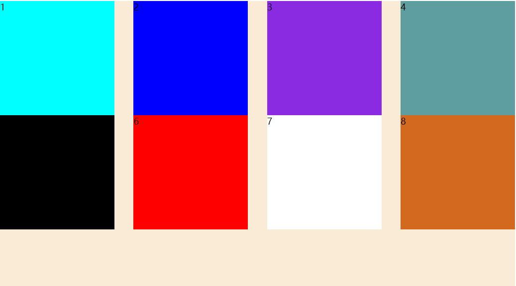
align-content:flex-start;
align-content:center;
align-content:flex-end;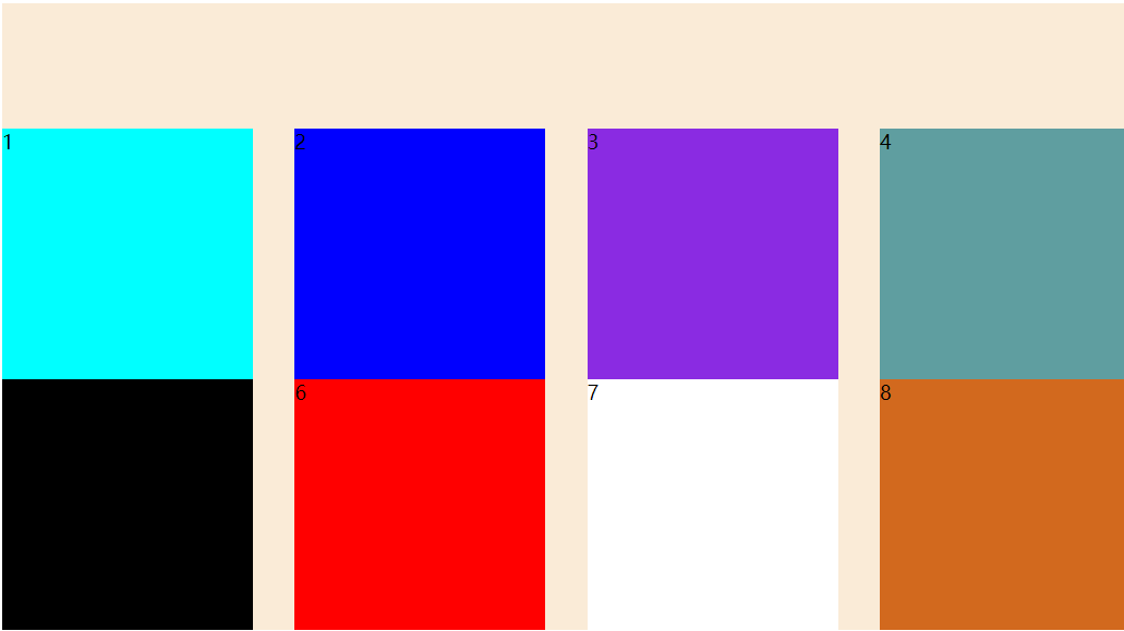
align-content:space-around;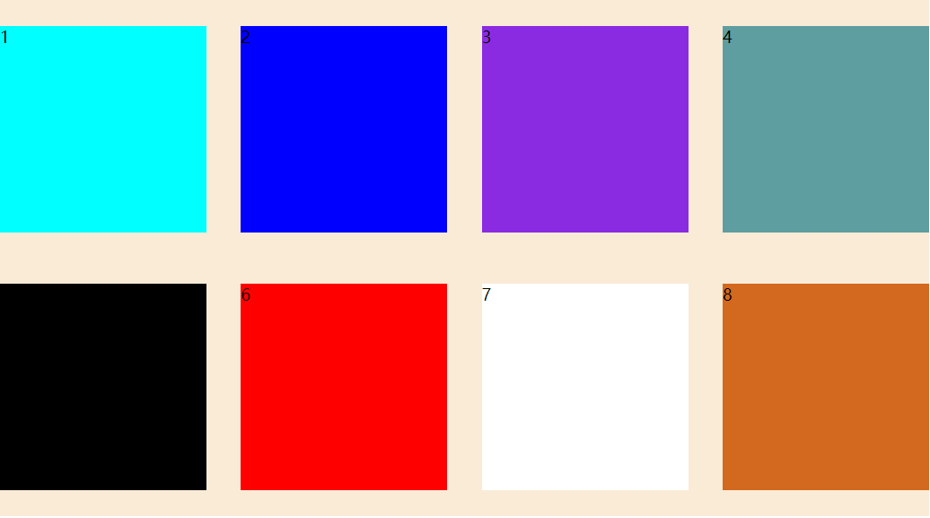
align-content:space-between;
Flex-flow就是flex-direction和flex-wrap的合写
flex-flow:row wrap;